On this tutorial, you will learn how to create a personal portfolio in fireworks. Follow the steps by steps in order to create a simple portfolio website in adobe fireworks.
1- The website we will create on one page portfolio page, like in this :
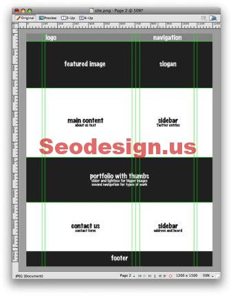
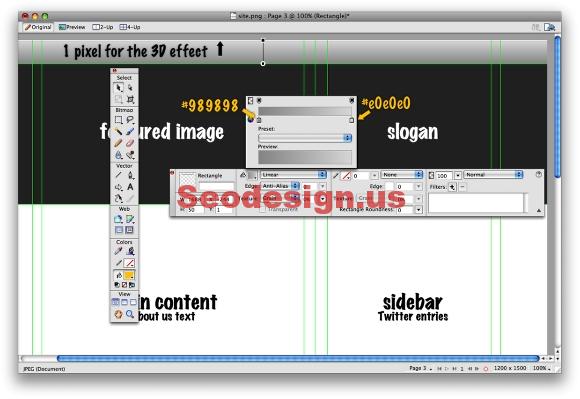
2- Let’s start with the Navigation and logo. In our wireframe we had set a 50px height area for the menu and where the logo will be placed. With the Rectangle Tool (U), create a rectangle with 50px height and 1200px width. Go to the Gradient Tool (G) and apply a vertical gradient on the rectangle. Change the colors to #989898 (bottom) and #e0e0e0(top). Then position the rectangle to 1pixel in Y, there will be a white line between the rectangle and the stage, it will create a very nice 3D effect in our site’s menu.
3- Place your logo, I used the abduzeedo logo with a very dark gradient for black to a dark gray. After that add a filter clicking on the (+) icon. Selec Drop Shadow. Use 2px for the distante, 100% for the opacity, 0 for the softness, and 315º.

4- Let’s add the menu links. My personal site will have only 3 links: About, that will be a text about carreer and on the sidebar a list with my last entries on Twitter. Portfolio, where I will show some of my works. And the Contact, where there will be a contact form and a hCard with my contact information.
I really like menus with the Link name and a short description right below it. In my menu I used Arial Black 18px, that is a font that pretty much every computer has and we don’t use it that much, with the description in a regular Arial 12px. Also I applied on the texts the same shadow I used on the logo. It will give a nice touch. However via CSS it will only be visible on Safari and the new Opera. Both have the Text-shadow property.
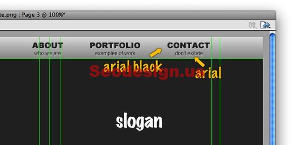
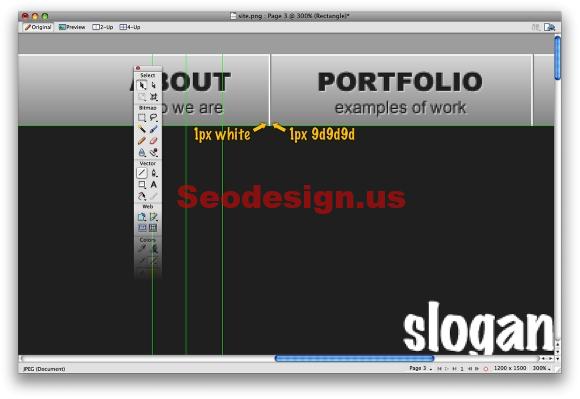
5- In order to make a clear division in our menu let’s create a divider. If you pay attention to nice 3D effects, they are very subtle and it’s kind of simple to create. In this case with 2 lines with 1px width and different colors, one light and other dark we can achieve a very nice effect.
6- Let’s do the graphics part of the site. I could use Flash to create an animation or a Javascript effect. The idea here is to show the importance of the creative process when designing a page.
Nowadays we can notice that more and more sites are using handwritten elements such as texts and skecthes, also different textures and vintage elements to give a more human feeling to the site. For this design I will use a texture I created in another tutorial I wrote, the “Super Cool Frilly Bits Typography”. Just download the PSD and export the background, then place it on the center of our Featured area. You will have to resize it to in order to make it fit with the layout. Also you will have to create a black background behind the texture image. That will make our layout work no matter what the user’s screen resolution is.

7- Here I used a screenshot from one of the recent projects I worked on and placed it on the stage. Then I just adjusted it to fit to the Featured area using the Mask featured.

8- Now let’s add the hand-drawn elements. Firstly I chose a nice font from dafont.com, it’s called “Return of RelayScript”. Also I used another font, Helvetica Ultra Light, because I think that font gives an elegant and modern feeling to the design.
For the other elements some I used the bursh tool and others some vectors from iStockphoto.com. The whole idea of the design is to show the steps of the project with the suggestions and adjustments that are made throughout the process.

9- For the About area, where almost all the text of the site will be, I used the Divine Proportion to divide it in 2 columns. I recommend you to read a very nice article from Smashing Magazine called Applying Divine Proportion To Your Web Designs, they explain how and why it works so well.
So, my main area was divided in 2 columns, one with 605px and the other with 397pixels, with a padding left and right of 25 pixels in each column.
For the texts, the first paragraph of the main content I used Arial Black with 20px size and 140% line-height. And I used the same to create the title of the sidebar. The rest of the text on the main area I used Arial 14px and 140% line-height in Black. However for the sidebar I reduced the font size to 12px and changed the color to gray #666.
Also, I created another rectangle and filled it with a gradient. Again, I used the 1px space to create a subtle 3D effect.

10- The portfolio area will basically have thumbnails of works, a title, a little description and a second navigation to choose from Print and Web works. I created a rectangle of 1200 pixels width by 290 pixels height. I used #999 for the color and a texture from the Styles Palette called Diagonal 30px width. Also I applied an Inner Shadow to the rectangle with 0 Distance, 65% Opacity, 4 for Softness, and Black for the color.

11- The thumbnails have 200×125 pixels and I added the wet-floor effect. To create this effect is pretty simple, just duplicate the image, go to Modify>Transform>Flip Vertical. After that go to Modify>Mask>Reveal All. Then with the Gradient Tool (G), use a black and white gradient and fill the image with it. Where it’s black it will become transparent and the white will appear. The grays will be midtones.

12- Here I finished the Portfolio with 4 images. For the title I used Arial Black, 32 pixels and Uppercase. Also I applied a Drop Shadow to it. For the other texts I used the same handwriting typeface that will be saved as image when mounting the HTML.
The second navigation used the handwriting font, but I created a circle to show the selected item with the Vector Path Tool. All the images will be shown in a Carrousel list, so the 2 icons of arrows will be the buttons to move the images.

13- The last part is the Contact Us. It’s just a form with Name, Email, and Message fields with a hCard icon on the sidebar where the user will be able to downlond my contact information. To create the form I used the Rectangle Tool, however if you want to create forms with real elements you can download form elements in PSD from the http://www.designerstoolbox.com/. They have images of all sorts of form elements from all major browsers and platforms.

Tutorial Source : Abduzeedo

