
More designers are opting to go back to the past for great ideas on web design. If you’re looking to start a blog and need some design ideas, you may want to think about going retro. Retro designs look beautiful, engaging and helps your website stand out from others. To give you some ideas on how you can use retro designs for your websites, here are 15 creative examples to learn from.
1. Thunder Fuel
Thunder Fuel uses a steam punk style design combined with sketch animations to create a unique presentation. They also use Flash to make their user interface interactive. It makes you feel like you’re using a multimedia device from the alternate future.
2. Thrush
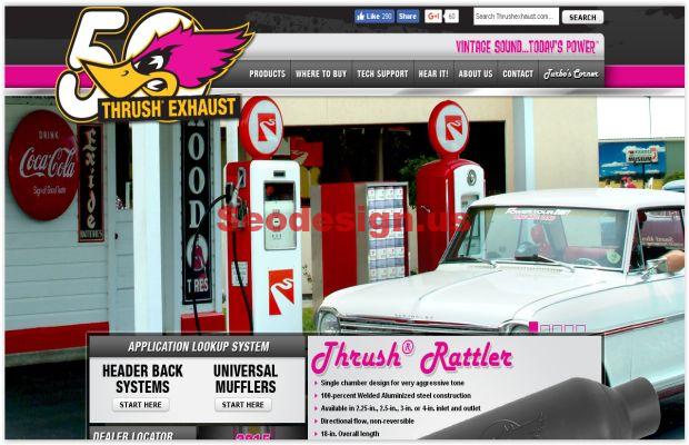
Thrush’s design is centered on a 60’s look with many modern elements. It pays homage to the 60’s with retro styled poster backgrounds. It completes the 60’s look with small vintage accents primarily through the font usage.

Forty Seven Media uses an 80’s denim washed font style in their opening headline. They keep the retro elements fairly small. It’s used more of as unique styling device rather than an over arching theme that plays throughout the entire site.
4. Bullet PR
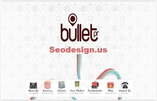
Bullet PR uses faded fonts to start off their retro theme. They introduce art from the 1920’s throughout their main page. To top it all off, they use devices (vinyl player, typewriter, rotary phones, etc.) for their navigation icons. This creates a really unique and charming look.
Torpedo Juice takes you back to the diner and drive thru era. They use a large classic signage from the 1920’s for their brand logo. However, they keep the other aspects of their design fairly simple and modern. For this reason, the designers ensure that they don’t create a dated look.
6. Web-o-matic
This is another 1920’s theme but most of the retro elements are reflected in the font and graphical accents. It takes inspiration from the old school American newspapers. It uses the types of graphics and typography that were common in those times.
7. This By Them
This By Them uses a background similar to parchment paper for their design. They use many different graphic elements like the kaleidoscope, black and white photography and flat icons. They combine retro elements from multiple eras to influence their unique design that marries contemporary with retro.
Team Fanny Pack uses a retro template for their entire website. The theme of the template is an 80’s newspaper. Everything from the fonts and photography filter reflects this theme. It’s a great way to present a news-oriented site without using a modern news theme that everyone’s familiar with.
Antique Piano Shop finds a balance of modern and antique perfectly. They don’t go overboard with the antique theme. They use small sketches from the early 1900’s as accents. Most of the design is centered on a retro look which is created by the font and logo.
10. Eric Henning
Sometimes, going with a retro design just makes sense. This magician uses old school magic imagery to design his site. It reminds you of the designs that Houdini used to advertise his shows in the 1920’s.
This tourism site plays into the retro country theme very well. It uses fire branded logos, faded fonts, beautiful photography and small town accents to attract travelers to come visit the city. This is retro done right.
Cottonseed oil tour takes you back to the 80’s with a road trip all over America. The vintage font, 80’s style van and a picture of a vintage map brings the look together. It also uses a very interesting color scheme that includes everything from brown, green, red and yellow.
13. Freelenz
Freelenz is more of a modern retro throwback. The design theme reflects the office culture of the 90’s. Everything from the font, hero image, to the small accents brings you back to that era.
14. Rejected Robot
This is another great example where going with a retro design makes sense. The website sells an 80’s style robot toy and it makes logical sense to go with the 80’s theme. The page is designed after 80’s style comic strips that many people grew up with.
15. Farinella
Farinella is a website for a local bakery styled after old school traditional delis and bakeshops. It uses the classic pin stripe design for the header and uses the deli style lettering/accents. What’s great about the design is that it’s set on a white background with enough space so that the font doesn’t crowd out the images and content.
Hopefully, these websites have inspired you to start a blog with a retro design theme. You can see that some websites are fully centered on the retro theme while others mix in retro elements and combine it with a modern theme. It’s up to you how far you want to take the retro style.


